Generating Multivariate Gaussians
import matplotlib.pyplot as pyplt
import numpy as np

def gensamples():

    # set the distributions
    Sigmap = np.eye(2)
    Sigman = np.eye(2)
    mup = np.array([-2, 0])
    mun = np.array([2, 0])
    npos = 20
    nneg = 20

    # generate the samples
    xp = np.random.multivariate_normal(mup, Sigmap, npos).T
    xn = np.random.multivariate_normal(mun, Sigman, nneg).T

    return (xp, xn)
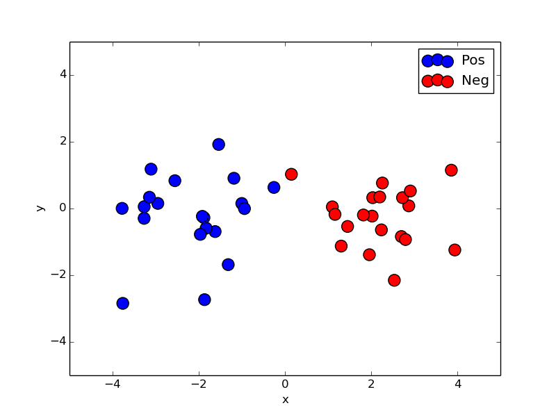
Scatterplot
Code:
if __name__ == '__main__':

    # generate the samples
    (xp, xn) = gensamples()

    # create the figure and plot the samples
    fig, ax = pyplt.subplots(nrows=1, ncols=1)
    pos = ax.scatter(xp[0,:], xp[1, :], s=150, color='blue', edgecolors='black', zorder=10, label='Pos')
    neg = ax.scatter(xn[0,:], xn[1, :], s=150, color='red', edgecolors='black', zorder=10, label='Neg')

    ax.legend()

    # set the labels and axes
    ax.set_xlabel('x')
    ax.set_ylabel('y')
    ax.set_xlim((-5,5))
    ax.set_ylim((-5, 5))

    fig.savefig('scatter_example.png')
    #fig.savefig('scatter_example.eps')
    fig.savefig('scatter_example.pdf')

    # show the image (blocking)
    pyplt.show()
Result:
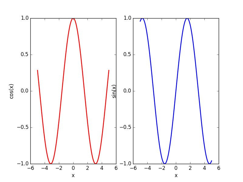
Multiple subplots
Code:
    x = np.linspace(-5, 5, 1000)
    y = np.cos(x)
    z = np.sin(x)

    plt.subplot(121)
    plt.plot(x, y, color='r', linewidth=2.0)
    plt.xlabel('x')
    plt.ylabel('cos(x)')
    plt.subplot(122)
    plt.plot(x, z, color='b', linewidth=2.0)
    plt.xlabel('x')
    plt.ylabel('sin(x)')

    plt.savefig('example.png')
Result:
Plotting contour
Code:
def ezcontour(ax, fun, range):
    x = np.linspace(range[0],range[1],300)
    y = np.linspace(range[2], range[3], 300)

    #code.interact(local={**locals(), **globals()})

    xx,yy = np.meshgrid(x, y)

    x = np.vstack((xx.flatten(), yy.flatten())).T
    zz = fun(x)
    zz = zz.reshape(xx.shape)

    ax.set_xlabel('x')
    ax.set_ylabel('y')

    levels = np.array([-1, 0, 1])
    surf = ax.contour(xx, yy, zz, levels, colors='k')